


Colour · 22 September 2026 · 5 min read
How to specify a colour you have only seen on a screen
No screen has ever shown a dyed wool correctly, and none ever will. What the trade does instead is work to a register of physical shades. This is how ours is built and how to specify from it.
A colour on a screen is light emitted at you. A colour in a rug is light falling on a dyed fibre and bouncing off thousands of tiny cylinders lying in one direction. They are not the same physical event, and no amount of calibration makes one a reliable proxy for the other. Add that no two screens agree, and the only safe way to agree a colour is a physical reference with a name both sides can write down.
What the register is
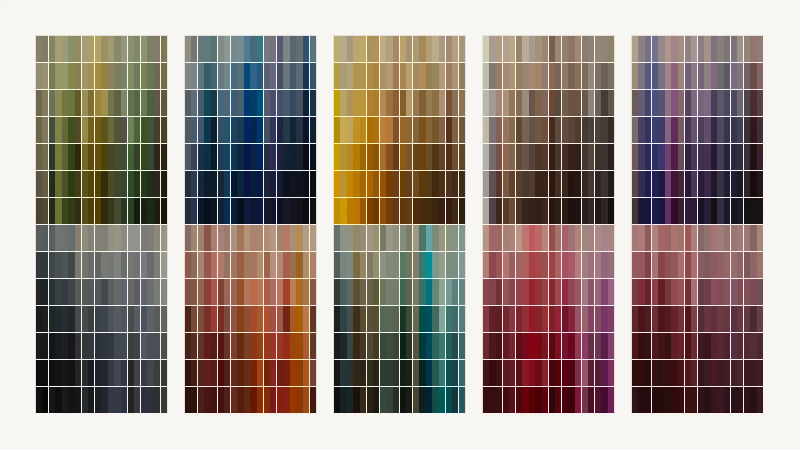
Our wool register holds 1’400 hand-dye targets. They are arranged in five hue families: greys and olives, reds and blues, greens and golds, wines and verdigris, roses and taupes. Each family is fourteen tone rows, N at the top as the lightest through to A as the deepest, and twenty columns, 01 as the saturated reference through to 20 as the closing variant.
That gives every shade a coordinate rather than a name, which is the point. A code reads CA 4N01: register CA, family 4, tone row N, column 01. Two people on two continents can hold the same shade in their hands and write the same six characters about it, and nothing is lost in the word olive.
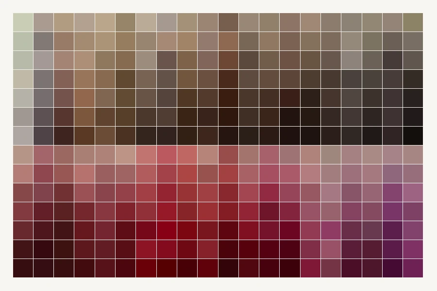
The structure is also how you navigate. Move up a family to lighten a shade without changing its character; move down to deepen it. Move along the columns to hold the same tone and shift the cast. A client who says this, but quieter is describing a move that the register can make precisely.
Why we show the register instead of a colour wheel
A colour wheel offers every colour, including the ones a dyer cannot reach in wool. A register offers only the colours that exist as dyed material. Everything on it can be made, has been made, and will be made the same way again, and that is what a specification needs.
On a product page, choosing a colour opens the register at the family closest to the shade the design is carrying, with the nearest shades to it on a strip above the grid. Picking a cell applies the dye to that zone of the rug and redraws it.
Poms, and why nobody skips them
A pom is a small bundle of the dyed yarn itself. It is the only thing in this process that is the actual material: the same wool, the same dye bath, the same spin. Hold it in the room, at the hours the room is used, against the floor and the fabrics it will live with.
Two things surprise people at that stage. A shade chosen under a north window reads warmer under an evening lamp by a noticeable margin; and a colour that looked strong as a 40-millimetre square on a screen can be overwhelming as four square metres of floor. Both are easier to see on a pom in the room than on any render, including the ones we make.
For a commission we also knot a swatch: a 20 by 20 centimetre piece in your palette and fibres, CHF 95, refunded against any order over CHF 5’000, two to three weeks to make. That is the last checkpoint before a loom is warped.
Dye lots
Hand-dyed wool is dyed in batches, and two batches of one shade are never bitwise identical. This is managed rather than eliminated: the yarn for a rug is dyed together, so one rug is one lot and any variation stays outside it rather than inside it.
The consequence for a project is worth stating plainly. If two rugs must match each other, they must be ordered together, and it should be said in the order that they are a matched pair. A rug ordered a year later in the same code will be the same shade to the register’s tolerance, which is close, but it is not the same dye lot.
The variation inside a single hand-dyed rug is not a defect either. It is called abrash, it is visible in almost every good knotted rug ever made, and in a large field it is the difference between a floor that looks woven and one that looks printed.
The four mistakes we see most
- Approving a colour from a photograph or a render. Both are light on a screen; neither is the dyed wool.
- Judging a pom against a white desk. Judge it on the floor it will live on, beside the fabrics it will live with.
- Choosing at one hour of the day. A north-lit morning and a lamp-lit evening are two different colours; a rug has to survive both.
- Scaling up a small sample by eye. A colour gains weight with area: on four square metres, a shade chosen as a swatch reads one step stronger than it did in the hand.
What to write in the specification
- The register code for every colour in the design, not a screenshot and not a colour name.
- The fibre for each of those colours, since the same dye reads differently in wool and in silk.
- Whether the piece is one of a matched set, and with what.
- Who has approved the poms, and on what date.
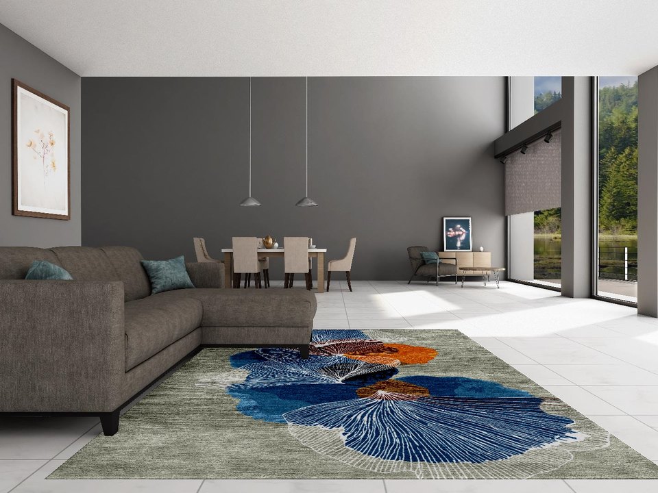
A render is a drawing instrument, not a colour proof. We build ours from the same dye values the register holds, which makes it accurate as a relationship between colours and never a guarantee of one.